How to Perform a Customer Cohort Analysis
Table of Contents

Understanding how different groups of customers behave over time helps teams make better decisions about who to focus on, what to fix, and where to invest. Cohort analysis groups customers based on a shared moment in time, like the date of their first purchase, and follows what they do after.
Do they return? Do they spend more? Or do they disappear? For data teams, it answers the types of questions that keep surfacing in meetings. What happened to last quarter’s new users? How long did it take them to come back? And what did that mean for revenue? Cohort analysis lets you answer that in a clear and actionable way. It helps you move from guessing to knowing, and then doing something about it.
We’ll use a practical example: measuring the time between a customer’s first and second purchase. Before jumping into how to build this in Sigma, let’s take a beat to understand why cohort analysis works and what it can show you that other methods miss.
A practical example: Time to second sale
Let’s say you’re managing analytics for an e-commerce brand. One of your team members flags customers who came in through a flash sale on skincare products. Traffic was up, and several new customers bought a trial kit.
Now the question is: did they come back?
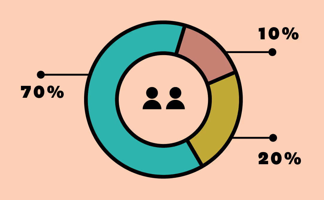
You decide to track this cohort, first-time buyers who entered through that promotion, and measure how long it took them to make a second purchase. That time-to-second-sale metric becomes the core of your analysis. After six months, you run the numbers. Seventy percent never returned. Twenty percent visited again but didn’t buy. The last ten percent? They came back and made another purchase within three weeks.
That might catch your eye, but more importantly, it points to next steps. With that breakdown, you can test variations in follow-up campaigns. Maybe you offer incentives to re-engage the 20 percent who returned but didn’t convert. Or investigate what product types brought the 10 percent back. Over time, this kind of analysis helps you shift from reacting to retention issues to proactively designing better outcomes.
Why cohort analysis works and what it can tell you
Traditional metrics like average order value or total revenue only tell part of the story. They show what happened, but not how customer behavior shifts over time, or how different groups respond after that first interaction. Cohort analysis gives you that missing context.
- See retention trends clearly. Instead of looking at churn as a single number, break it down by acquisition group. You’ll quickly spot which customers return after their first purchase and when they drop off. That insight makes refining onboarding, loyalty offers, and product timing easier.
- Spot revenue differences over time. Not all customers are equal, and cohort analysis makes that obvious. Some groups buy frequently but spend less. Others show up once a month and drop $300. Looking at averages can mask these patterns. Breaking it down by cohort helps you focus on the behaviors that drive long-term value.
- Tie behavior to campaigns. Knowing when someone entered your funnel lets you match behavior to the marketing or product push that brought them in. Maybe it was a discount. Maybe it was a launch. Either way, you can see if that effort led to repeat business or just one-time sales.
- Back strategic decisions with data. Pricing tests, new checkout flows, and revamped onboarding affect customer behavior. Cohort analysis helps isolate those impacts instead of guessing based on blended outcomes.
Cohort analysis doesn’t just show trends. It gives you something to act on. And when your tool lets you run these comparisons quickly, without complex modeling, you’re not stuck waiting for answers.
How to do a customer cohort analysis in Sigma
In most BI tools, cohort analysis takes time, technical skill, and a fair bit of workarounds. In spreadsheets, it often means layered formulas, nested logic, and constant updates to keep data fresh. Sigma simplifies all of that. You can build a cohort analysis directly on live cloud data, using your own logic and scale, without code. Let’s walk through an example that groups customers by how long it took them to make a second purchase.
To follow along, you’ll need a few inputs:
- Time of first order
- Time of the second order
- Customer acquisition cost (CAC)
- Lifetime value (LTV)
- Basket size
- Average order value (AOV)
- Net profit margin
- Percentage of product returned
NOTE: You can run this on millions of rows in Sigma without ever sampling or exporting to Excel.
Step 1: Define your cohorts
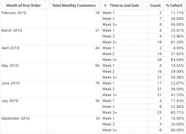
Start with a table that includes the customer ID, time of first order, and time to second sale. Then, decide how you want to group customers. For this example, we’ll use:
- Week 1 (1–7 days between purchases)
- Week 2 (8–14 days)
- Week 3+ (15+ days)

Step 2: Turn date differences into bins
Use the BinRange() function to assign customers to buckets based on the time between their first and second order.
Create a new column called Cohort Bins using the formula:
BinRange([Time to 2nd Order], 8, 15)
This creates:
- Bin 1: less than 8 days
- Bin 2: 8 to 14 days
- Bin 3: 15 days or more
The result will return a 1, 2, or 3, which you can label more clearly in the next step.

Step 3: Name your cohort groups
To make the output more readable, apply the Choose() function to map each bin number to a label.
Create a column named Time to Sale with this formula:
Choose([Cohort Bins], "Week 1", "Week 2", "Week 3+")
Tip: Double-check that each cohort label matches the correct bin group. This makes the rest of your analysis easier to follow and explain.
Step 4: Group your data
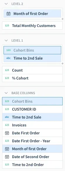
Next, apply levels to your worksheet to group by Month of First Order and then by Cohort Bin. This allows you to break down the number of customers who fall into each cohort by month.
To count customers in each group, create a new column called Count with the formula:
Count()
At the month level, create another column called Total Monthly Customers using the same Count() formula.
Then, add a new column at the cohort level called % Cohort and calculate the share using:
[Count] / [Total Monthly Customers]
Format it as a percentage using the column menu.
Step 5: Analyze and adjust
Now that your cohort bins are defined, you can slice the data however you like. Want to break it down by acquisition source instead of purchase timing? Try filtering by channel or campaign. Interested in high-return customers? Layer in LTV or AOV as an additional view.
The flexibility here is the point. You can explore behavior across time, segment by different attributes, and test new logic without rebuilding your dataset or writing SQL. And since it’s all running directly on your warehouse, there’s no need to export or sync anything manually.
Build smarter segments, not just prettier dashboards
Cohort analysis shows you the movement behind the metrics. When you can track how customer behavior shifts over time, you stop relying on assumptions and start designing strategies that work. In Sigma, these analyses don’t require code or complicated workarounds. You can create custom logic, filter by attributes that matter, and work directly on your cloud data in the same interface your teams already know. The best part is you don’t have to wait for someone else to run the numbers. If you’re ready to explore this for yourself, we’ll walk you through it.
Let’s Sigma together! Schedule a demo today.


